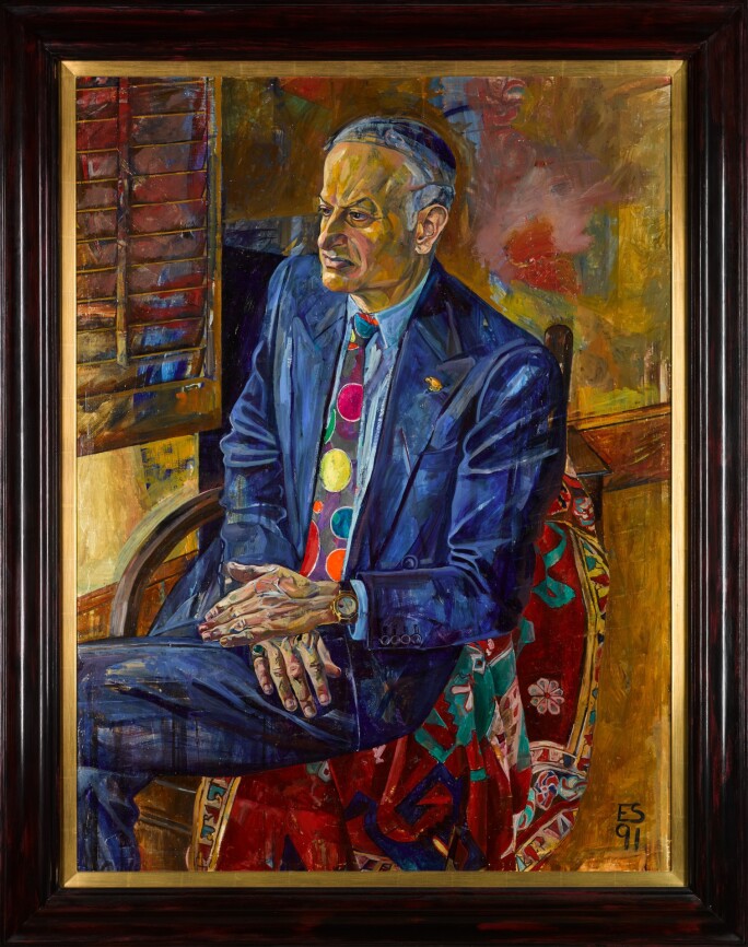
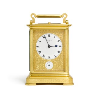
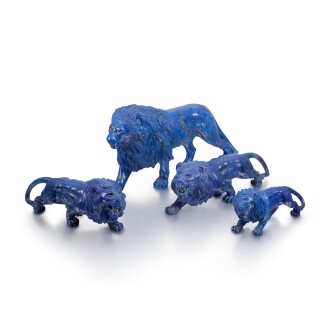
N aim Attallah was a quintessential gentleman. Always impeccably turned out, his finely tailored clothes lined with exquisite silk, the cuffs of his shirts adorned with wonderful cufflinks, and for each wrist its own watch! He always wore vivid coloured odd-socks, and later in life his ensemble was replete with a smart walking cane. The collection offered here is a distillation of the many wonderful things that aroused Attallah’s interest and are a celebration of the colourful. Colourful; an adjective which perfectly sums up the man who put this group together.
Auction Highlights


Naim Attallah CBE (1931–2021), was born in the British Mandate of Palestine, and came to London in 1949. Initially this was to study engineering, but in his long career Attallah was a professional ping-pong player, factory worker, bouncer, currency dealer, company director, racehorse-owner, film and theatre impresario (producing ‘The Slipper and the Rose’ in 1976), parfumier, chocolate-maker, and (for which he is perhaps best remembered) publisher and magazine proprietor.

The Guardian in 2000 also happened to describe him as a "legendary adorer of beautiful women". In the early 1970s he met John Asprey, and became joint managing director, and ultimately chief executive, of the eponymous luxury goods group, vastly expanding its turnover. He also acquired Quartet Books (1976), The Women’s Press (1977) and several magazines, including the Wire, the Oldie and the Literary Review; he was appointed Commander of the Order of the British Empire (CBE) in the 2017 New Year Honours List for services to literature and the arts.


Attallah’s collecting passions were often informed by the different influences and interests of his life. His Mayfair apartment was a veritable treasure trove. Walls, beds and floors were adorned with rugs and fine textiles. Pictures, miniatures and icons were closely hung in a salon arrangement in both public and private rooms. Fitted cabinets were filled with densely packed, but carefully arranged, objects of wonder. From lustrous Wedgwood to curvaceous Tiffany art-glass; from the angularity of Art Deco to the iridescence of Antique glass and sculptural forms from Africa contrasting with delicate jewel like Russian enamels. These extraordinary objects jostled for attention and yet were unified by a rich variety of texture and above all colour.
Naim Attallah and Asprey
In 1956, a young bank clerk and his finacée stood in front of a glittering shop window, looking at the engagement rings displayed by a luxury jeweller that had been trading for over 150 years. The jeweller was Asprey, the shop was the flagship in New Bond Street and the bank clerk was Naim Attallah: this is said to be the moment when he vowed to come back, one day, to enter the store and this time be able to buy one of the treasures they offered. This he certainly did, many times over the course of a relationship with Asprey that lasted decades and saw him move from keen patron to the company’s Chief Executive. He first met John Asprey around twenty years after gazing at the window display, this time inside the shop’s doors and browsing the carriage clocks. Through John, he was introduced to Eric Asprey, the company’s Chairman, and was employed to consult on Asprey’s client strategy in the Middle East. After serving on the board, he became Chief Executive in 1990 and led the company through a period of acquisitions that included Watches of Switzerland, Garrard, the Edinburgh-based Hamilton & Inches and Parisian jewellers René Boivin. In this sale, we see an array of objects that reflect Attallah’s life-long love for Asprey and his expansive collecting interests, which included watches of high quality, decorative work in colourful hardstone and finely-wrought objets de vertu.
Tiger King: Big Cats in the Collection
Gentleman’s Accoutrements

D aisy Makeig-Jones was one of Wedgwood’s most distinctive designers, reinvigorating the brand during the 1920s with her imaginative, highly saturated designs. Her best-known and most popular line of ceramics, known as ‘Fairyland Lustre’, sees mythology from various cultures collide in dense, richly coloured designs. These are far from the restrained neoclassicism which had long been associated with Wedgwood: these designs teem with magical beings and splashes of vibrant colour in a way that rewards slow, curious scrutiny.

Makeig-Jones was first employed by Wedgwood as a ‘paintress’ in 1909, and gained a position as a designer with her own studio in 1912. She demonstrated a readiness to absorb influence from diverse sources, both in terms of ceramic technique and the narrative content of her designs. The heightened vibrancy of colour and lustre in her work comes from her decision to combine two new innovations in the field: ‘powder blue’ colouration and ‘reduction lustre’ technique. The brilliant ‘powder blue’, an imitation of the Chinese colouring known as bleu soufflé, had been recently developed by James Hodgkiss in 1910, while Makeig-Jones first saw the jewel-like ‘reduction lustre’ at a 1909 exhibition of J. V. Goddard’s ‘Lustrosa ware’. Her creative synthesis of these techniques first took the form of a series known as ‘Ordinary Lustres’ in 1914, but her characteristic ‘Fairyland Lustre’ made its first appearance in 1915 and remained popular throughout the First World War and well into the 1920s.
Makeig-Jones’ Fairyland is a place well-populated with elves, goblins, sprites and imps from an array of mythological sources. While she often copied figures and outlines from contemporary illustrators such as H.J.Ford and Gustave Doré, the narratives, symbols and imagined scenery are often taken from Japanese, Indian and Chinese folklore. The almost dizzying impact of a piece of Fairyland Lustre also stems from the creative collision of multiple designs in one work: a ginger jar in this sale brings together her designs called Fairy Slide, Bridge, White Pagodas and Bird’s Nest Robbers, all bordered by carefully crafted, original border patterns called the Rhages Bead and the Beowulf Bead.
The superabundance of these complex designs is best experienced like a tentative exploration into a strange, luxuriant land. When slowly poring over these crowded and psychedelic compositions, the many rich details of Makeig-Jones’ world steadily emerge from the busy whole. In the footed bowl appearing in this sale, the gilded orange sky and the violet tree dominate the exterior composition, but nestled between the two is a warmly-lit colonnade and an enclosed garden, a glimpse of Fra Angelico-like serenity amidst the wildness of Fairyland. On the base of the bowl’s interior, a mermaid’s stylised hair merges into the aquatic background in a way that seems familiar from the art nouveau posters of Alphonse Mucha, with these sinuous whirls carefully contained by a contrasting geometric double border. On another of the pieces in the collection, a canoe moving through an ultramarine lake leaves ripples that are a startling lime green. Just a few moments of examination would reveal plenty more surprises – when looking over a piece of Makeig-Jones’ Fairyland Lustre, a patient and curious eye is sure to be rewarded with a multitude of hidden stories, bursts of colour and fantastical characters.
Read Less
J ean Dupas’ poster for the 15th annual Salon of Decorative Artists (lot 136 ) has become one of the iconic images of the Art Deco era – it often features in overviews of Art Deco graphics, and was even used as the emblematic cover image of Alastair Duncan’s 1988 book on the movement, Art Deco. This is curious, though, for a design that is so ambiguous: this is a work that is arresting at first glance and remains mysterious even on further scrutiny. Dupas has a style all of his own, and it is demonstrated at its most impressive in this languid, evocative design.

Jean Dupas (1882-1964) followed in the tradition of earlier pre-war artists such as Toulouse-Lautrec and Mucha in forging a strongly individual style that he could readily apply to posters and advertising as well as to painting. He won the Prix de Rome for painting in 1910, and his talent for draughtsmanship is demonstrated in a drawing that is also being offered in this sale – however, his distinctively rosy-cheeked, long-necked women could be seen in all manner of contexts during the inter-war period, from advertisements for the Saks department store on Fifth Avenue to posters in the London Underground. It is worth acknowledging what may sound obvious, though: this design does not look like one of the typical ‘Art Deco posters’ that are so easily recognisable and widely imitated. When asked to picture an ‘Art Deco woman’, we would be more likely to think of the merry dynamism of the era’s fashion illustration, the insouciant glamour of the ocean liner passenger, so why do Dupas’ women look more stylised and otherworldly? Similarly, the era’s posters often feature confident lines, prominent lighting and simplification that tips into semi-abstraction. If this is such a famous example of Art Deco poster art, where are the bobbed hairstyles and blocky text we know so well?


The answer is best found when we consider the occasion for the poster and the reasons why Dupas chooses to contrast recognisable styles and symbols. The Society of Decorative Artists was a group of leading French artists and designers, who held annual Salons annually after 1904 and reached its peak influence with the era-defining International Exhibition of Modern Decorative and Industrial Arts in 1925. An artistic event is not a ‘product’ in the same way that a bottle of Campari or train tickets are a product, so the designer of the event’s poster has considerably more freedom to evoke a more abstract mood that suggests the creativity of the artists exhibited. This is what allows Dupas the scope to combine history and future in this distinctive design. On the one hand, we have the almost metallic quality of the skin depicted in the poster, adding a touch of the machine that is enhanced by the stiffly unnatural position angles of the wrists. The decision to depict the loose blonde hair as a silvery white ripple is also a clearly stylised element, adding a touch of the streamlined dynamism that is so characteristic of Art Deco’s futuristic interest in mechanical movement. However, the future and the machine are not the overriding impression of this poster: Dupas jumbles these elements together with classical and historical elements that ground the spirit of the 1920s in the world of art history. The necks and arms of the women, which can seem industrial or piston-like, are interpreted by Jacqueline du Pasquier as gestures towards antiquity, an example of Dupas’ recurring artistic motif of the architectural column. This gives us one way to interpret the subject-matter of the poster: the golden apple could be the Apple of Discord, fateful trigger of the Judgement of Paris and then the bloody Trojan War. An interpretation that looks to Ancient Greek myth makes sense in the context of an art exhibition (compare this with the many depictions of the Judgement of Paris in the history of Western art) and also chimes with the frieze-like flatness of Dupas’ figural arrangement. However, that wouldn’t quite explain all of what we see in this poster. The woman on the left, far from looking recognisably Classical, sports a tall, perhaps slightly powdered hairstyle in the manner of the eighteenth century. Dupas seems to have been compelled by the artificiality of styles in the Rococo era, and Marie Antoinette’s famous coiffure containing a model ship features in his similar 1927 poster for The Student Ball . The rose on the left also seems to make more sense in an eighteenth-century art-historical context than that of Greek myth – see, for instance, Le Brun’s portrait Marie Antoinette with a Rose (1783) at Versailles.
Dupas forces these different spheres to collide in this poster, without making them easily cohere. Instead of neatly paying tribute to one theme or era, the poster luxuriates in the symbolic resonances and contrasting styles of these differing art-historical periods, energising them with a spirit that is noticeably Art Deco. This remarkable poster creates such an impact, and has become so iconic, largely because of Dupas’ striking ability to merge past, present and future with such confidence and originality.


