W hen the Brooklyn-based interior designer Taylor Migliazzo Simon takes on a new project, her first step often involves turning to Pinterest to stoke visual inspiration. Recently she was scrolling through the image-sharing social media service, trawling for ideas that might work for her clients. While absentmindedly saving images, she eventually realized an unusual pattern that kept turning up again and again in her findings.
Migliazzo Simon, who admittedly favors textured tones and neutrals over typically bright colors, started noticing that many of these tasteful rooms that had caught her eye featured a single touch of red within them – anything from the subtle burgundy shade of a throw blanket, a cherry-red picture frame or a scarlet-toned accent wall. To her, the inclusion of that single color made a space come together in an idiosyncratic way, even if the particular aesthetic itself varied wildly from, say, Brutalism to maximalism. “All of these rooms have that pop of red that looks really good and really intentional,” she remembers thinking.
After she noticed this trend cropping up on Pinterest, she began seeing it everywhere in her daily life: A stranger’s maroon-tinged socks peeking through their pants on the subway. A pair of red shoes clomping down the sidewalk. A hint of shimmering red lipstick, a noticeable shock on an otherwise neutral outfit.
From these observations Migliazzo Simon developed her “unexpected red theory,” which she documented in a now-viral TikTok video. In it, she defines the theory as “basically adding anything that’s red, big or small, to a room where it doesn’t match at all and it automatically looks better.” As an example, Migliazzo Simon showed an image of a modern take on an 80s-era bathroom – with gold faucets and blue-green marbled tones – with red sinks lending a chic albeit unconventional feel to the washroom. “I feel that if you're including that unexpected red in your wardrobe or your home, it’s a choice,” Migliazzo Simon tells Sotheby’s. “Almost tongue in cheek.”
Watch on TikTok
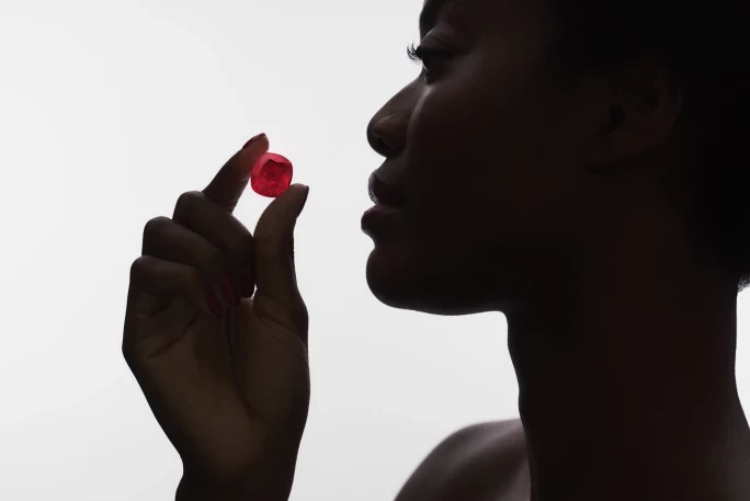
Throughout history, red has been regarded as a maximalist hue signaling at once emotive passion and danger in the natural world. Studies have even shown that the color red is a potent marker of guiding attention within humans, even capable of impacting motor abilities. So it’s fitting that red similarly draws the eye in a design context.

“You can’t be shy if you’re going to add a bold color.”
The unexpected red theory is particularly well-suited to interiors, where countless design accents can enliven a space. But it doesn’t have to be solely relegated to interior design. A chunky, 18 karat yellow gold ring engraved with red insignias, for instance, or the striking coral of a stella-dial Rolex Day-Date watch can elevate a simple look to give it an irreverent and stylish feel.
The most important tip Migliazzo Simon can offer when applying the unexpected red theory, for styling artworks, thinking of accent design elements and within personal wardrobe choices alike, involves going into it with the right attitude. By including a potentially polarizing color like red, “you’re clearly making that decision and you're making a bold choice to stand out,” Migliazzo Simon says. “That applies with interiors as well. You can’t be shy if you’re going to add a bold color like that, especially.”

The use of red within design circles can be contentious, of course, as it’s hardly a neutral tone. Migliazzo Simon says that clients of hers in the past have been skeptical about taking the step of using a bold red in their homes. Yet this design choice can often be surprising and result in intentional-looking spaces and sartorial proclivities alike. “If you’re choosing to do a red lampshade that would normally be beige, or if you’re doing a red rug that would normally be tan,” she says as an example, “it shows that you’re confident in what you’re wearing and what you decorate your home with.”
Taylor Migliazzo Simon’s Picks
The Brooklyn-based designer stopped by Sotheby’s to preview the upcoming Design Week auctions (on view 31 May-5 June in New York) and share her favorite works from the sales.
Cy Twombly’s ‘Death of Giuliano de Medici’
“Cy Twombly’s art is seeped in historical significance, and Death of Giuliano de Medici is no exception. It represents a dramatic historical death – and also brings in the unexpected red theory, although the red in this painting depicts something dark!”
Jean Prouvé’s Pair of ‘Demountable’ Chairs
“These quintessential Jean Prouvé chairs are a classic and timeless addition to any home. I love the deep red-brown tone of the metal legs on this particular pair, which would blend well with any decor style.”
Charlotte Perriand’s Rare ‘Nuage’ Bookshelf
“Charlotte Perriand’s work balances form and function, and this ‘nuage’ bookshelf is the perfect depiction of that. Its pistachio green color is the perfect complementary tone for something red.”
Set of Six ‘Drouant’ Side Chairs
“I am loving the return of Art Deco design, and Émile-Jacques Ruhlmann was one of its most important influences in the 1920s. This set of ‘drouant’ side chairs is also the perfect way to incorporate the unexpected red theory.”
Thomas Webb & Sons’ ‘Dancing Girl’ Vase
“Who doesn't want a token from the Gilded Age in their home? This stunning red and blue vase by Thomas Webb & Sons would be perfect to showcase on top of a beautiful pedestal.”
Alberto Giacometti’s ‘Feuille’ Floor Lamp
“Alberto Giacometti was one of the most important sculptors of the 20th century, and this piece illustrates why. It’s the classic silhouette of a metal lamp but with a twist. I love pieces that at first glance look simple, but the more you observe the more that beautiful details reveal themselves.”


