Blake Gopnik Charts American Art from Warhol to Ligon
Blake Gopnik Charts American Art from Warhol to Ligon
By
Blake Gopnik| Dec 15, 2023
From the new cultural assertiveness which accompanied the US's entry into WWI to its ever-evolving interrogation of the iconography of commerce, critic Blake Gopnik explores what makes art American
From the new cultural assertiveness which accompanied the US's entry into WWI to its ever-evolving interrogation of the iconography of commerce, critic Blake Gopnik explores what makes art American
I adore America and these are some comments on it. My image is a statement of the symbols of the harsh, impersonal products and brash materialistic objects on which America is built today. It is a projection of everything that can be bought and sold, the practical but impermanent symbols that sustain us.
Those words represent Andy Warhol’s earliest statement about his Pop art, published early in 1962. That’s when the art world first got to confront his novel works, in a New Talent USA issue of Art in America that gave big play to an image Warhol had appropriated from a storm-window ad.
Andy Warhol with 500 Brillo boxes at Stockholm’s Moderna Museet, 1968. Photo: Courtesy TT News Agency/Alamy Stock Photo, photo by Lasse Olsson
In just three heartfelt sentences, written before Warhol had fixed on his “dumb-blonde” manner, he managed to distil some of the central preoccupations of American art for the previous 50 years, and also for the 60 that followed. His statement posited that the US itself was American art’s vital subject; that this subject is to be both adored and critiqued; and that the nation’s signature commerce offers up the most potent symbols for exploring American virtues and vices.
An iconic subject is not an inevitable subject. A century and more after the birth of the US, the country’s most noteworthy artists – Cecilia Beaux, Mary Cassatt, James McNeill Whistler, John Singer Sargent and so many others – were still making works that at most applied a touch of local American colour over an identifiably, deliberately European base. They stood as American art-makers more than as makers of American art.
“Artists in the US only felt an irresistible urge to become manifestly American in the years around the First World War”
Artists in the US only felt an irresistible urge to become manifestly American in the years around the First World War. That is when their country had, for the first time, asserted itself as an unavoidable global power in all things military and economic – but not yet cultural. Fixing that lack became a central preoccupation.
As the political essayist Randolph Bourne put it in a piece published in late 1917: “If America has lost its political isolation, it is all the more obligated to retain its spiritual integrity. This does not mean any smug retreat from the world, with a belief that the truth is in us and can only be contaminated by contact. It means that the promise of American life is not yet achieved, perhaps not even seen, and that, until it is, there is nothing for us but stern and intensive cultivation of our garden”. That “cultivation” being a visibly American “refocusing of human energy on art and the intellect,” in the words of the historian James Dempsey.
Writers were the most obvious gardeners of that moment, with their endless search for the Great American Novel. (F Scott Fitzgerald’s The Great Gatsby, from 1925, was the evident Jazz Age contender.) But visual artists felt the same pressure, to which a new one was added: by coincidence, America’s newfound global sway coincided with the rise of radically new modernist styles that were largely the products of Europe. To match their nation’s Great Power status, its artists needed to Americanise Modernism. The most obvious way to achieve that was to combine Europe’s new styles with subjects that were iconic of modern American life, already recognised around the globe as different from life as lived elsewhere.
Just three years after the end of the war, Stuart Davis attempted that combination. He built Cubist-inspired paintings around classically, recognisably American products such as Lucky Strike cigarettes – the American Tobacco Company was selling 15 million of them daily in the year the war ended – and Sweet Caporals, under whose trade mark Davis painted the words “U.S. America”.
“The most compelling American art might come from an act of pure ostension”
That declaration of origin mattered, because not every modern vision of a modern product necessarily stood for the country it came from. Pablo Picasso, Georges Braque and other avant-gardists in France also painted their national brands, such as bottles of Pernod or Suze, but those stood for the idea of modern life in general, with its natural home in the City of Lights, rather than a particular Frenchness. Parisian artists depicted the modern alcohol they happened to drink, without meaning to talk about where that booze came from.
Whereas in the US, a colonialist creation with no national ethnicity and few cultural traditions that stood out as its own – none of England’s royal traditions, none of the ancient cathedrals of France – its aggressive production and consumption of goods came to count as hallmarks of nationhood.
Davis was working in Jazz Age boomtimes, so he could capture his nation’s identity in an almost completely positive vision of its commercial culture. But by the end of the 1920s, the sufferings of the Great Depression made it hard to be a cheerleader for capitalism. In the dozen years before the Second World War, artists, sometimes truly starving, often declared their American identity through images of pain and social failure. In 1941, for instance, in the prestigious annual survey of Directions in American Painting at the Carnegie Museum of Art in Pittsburgh, first prize was given to Tom Loftin Johnson’s American Pieta, circa 1941, which depicted the horrors of a lynching, as did a painting by Robert Gwathmey that won an award in 1943, adding that subject to a catalogue of miseries in the American South. What now counted as an “iconic” American image could also represent, as Johnson put it, “the greatest blot on our democracy and our national pride”. Racial oppression stood as an anti-brand for the country and its troubles; depicting Blackness with sympathy could stand as a trade mark of the Progressive Movement’s reformist ideals.
Albert Barnes, the great Progressive Era collector, had declared that, compared to anything produced by white culture, the traditional songs and rituals of the Black church were “the single form of great art which America can claim as her own” – up there, he said, with the great cathedrals of Europe. With such notions in the air, it makes sense that when searching for iconic American subjects, even white artists like Johnson would turn to the nation’s Black experience, however painful that was known to be. Or maybe that experience called out for depiction because it seemed such a perfect synecdoche for the nation’s larger state of crisis, and because it was so peculiarly American compared to other social ills with parallels in Europe.
Morton Livingston Schamberg and Elsa von Freytag-Loringhoven, God, circa 1917. Photo: The Louise and Walter Arensberg Collection, 1950
Potent new subjects, notably American in their potency, still couldn’t solve a problem for artists eager to make art that registered as fully unique to their nation: as Barnes had complained, the modern styles used to render those subjects stood as visibly weak derivations from the new art of Europe. The solution, which only a few at the time could see, was to almost completely abandon traditional Old World notions of style.
There had been hints of this in New York in 1917, when Marcel Duchamp had presented his sculpture, Fountain, which was nothing more than an unaltered porcelain urinal, a product of a new industry and commerce that he and others understood as notably American. (An American-made “all-porcelainous” bathroom had won a gold medal at the 1904 St Louis World’s Fair.)
“Duchamp cited plumbing and bridges as America’s only contributions to art”
Defending his piece, Duchamp cited plumbing and bridges as America’s only contributions to art. Two of his colleagues-in-Dada seem to have taken up that idea: toward the end of the First World War, Morton Livingston Schamberg and Elsa von Freytag-Loringhoven came up with a sculpture called God (circa 1917) that was a length of plumber’s piping joined to a builder’s mitre box. Like Duchamp, they had discovered that the most compelling American art might come from an act of pure ostension – an act of merely pointing to America’s most iconic objects, without obscuring them behind stylistic filters. Such pointing avoided the distraction and copycatting – the “Europification” – that a gloss of modern style could bring.
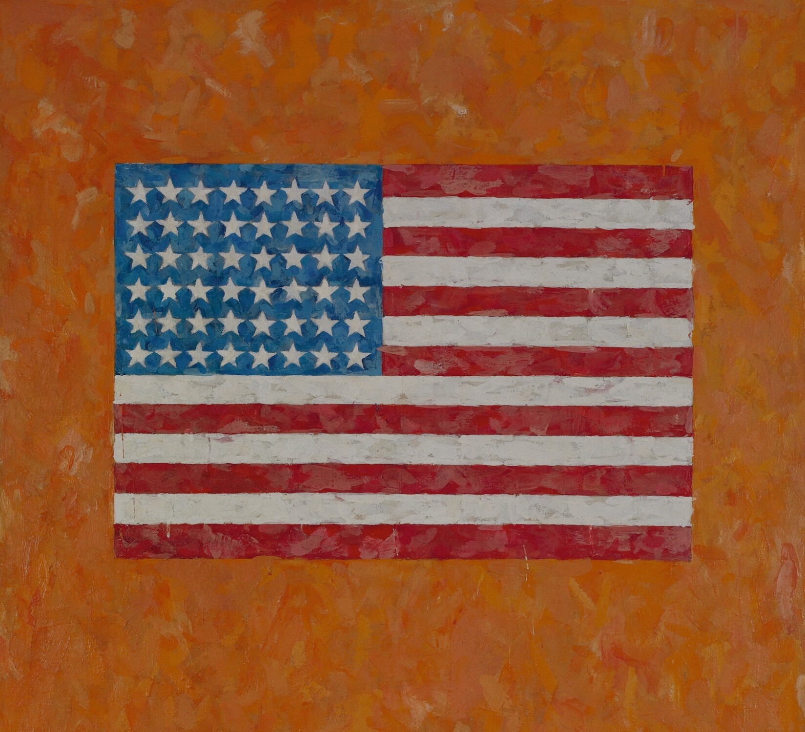
America’s ostensional tradition came into its own after the Second World War, with the country’s return to wealth and the new Cold War nationalism of the Eisenhower era. That’s when Jasper Johns made his first painting that transcribed the American flag on to canvas with a bare minimum of aesthetic elaboration. On top of its iconically American subject – the brand logo for an entire nation – the transcription itself, in its very directness, counted as archetypally American, like when “simple” Ben Franklin had gone without a wig among the bewigged elites of France. Or when America’s advertising men first learned to sell the steak, before the sizzle was even at issue.
Glenn Ligon has since continued his series of neon signs with works such as Double America 2, 2016. Photo: Courtesy Glenn Ligon, Hauser & Wirth, New York, Regen Projects, Los Angeles, Thomas Dane Gallery, London and Galerie Chantal Crousel, Paris, photo by Brian Forrest
Warhol saw the first Johns flag before almost anyone else, early in 1956, when it was shown in a department-store window next to one with a dull Warhol drawing. The Pop art Warhol went on to make realised the full potential of Johns’s ostension as an American artform. When he described his storm-window image as a “projection of everything that can be bought and sold”, it was almost a simple description – he had used an overhead projector to trace the ad onto his canvas, adding few stylings of his own. His Campbell’s cans and Brillo boxes followed from there. By avoiding the editorialising that style almost always imposes, the ostension involved in those pieces allowed him to combine the celebration of a Lucky Strike pack by Davis with the critique of a lynching scene by Johnson, or at least to put both in play at once. It let Warhol “adore” America, even as he allowed it to be represented by its “harsh, impersonal products”.
That ambivalence went on to be the hallmark of some of the best and most classically American of America’s contemporary art.
In 2008, the New Yorker Glenn Ligon created a huge neon sign, descendent of the glowing signage depicted by Davis, whose seven letters simply spelled out the name of his nation, A-M-E-R-I-C-A, the way a brand gets trumpeted in Times Square. The front of Ligon’s tubing, facing us, was coated in black paint; the back, uncoated, let white light escape onto the wall behind.
This is art that points to the US itself as an obscuring and an effulgence, a cancelling and a declaration, a place where Black power might need to outshine white privilege by darkening it – and, especially, a place whose public forum is commercial space. What could be more American?
Blake Gopnik, a contributing critic for the New York Times, is the author of Warhol, a comprehensive biography of the Pop artist published in 2020 by Ecco at HarperCollins. He is currently working on a biography of the Philadelphia collector Albert Barnes